UX Week: Day 1
I’m here in San Francisco at UXweek 2009, sent by Riverbed, determined to learn all I can and rub shoulders with the best and brightest minds in the industry. It’s been a really cool couple of days so far. I’ve met some really cool designers and got to pick their brains on their team practices. The food, oh the food: it’s excellent (ahi tuna? creme brulee? smoked salmon? green tea cookies? Pinch me.)
Um, back to the main subject: I also attended a bunch of seminars and heard some brilliant talks.
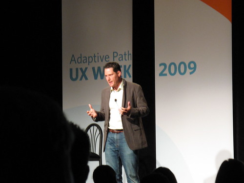
Keynote - Matias Duarte - Designing webOS
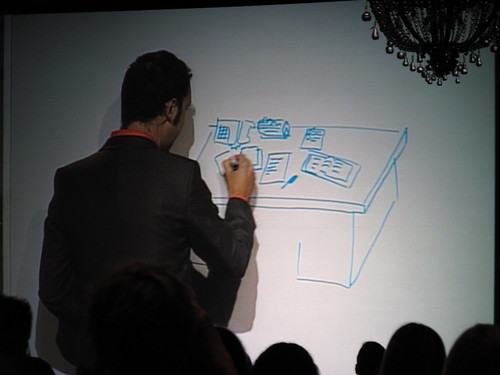
Matias came up and talked about how the process of webOS came to be. They apparently began with a vision of the “Mad Men” 1960’s-style office environment, complete with the desk, paper calendar, wall clock, assistant, etc etc. He proceeded to label each set of office equipment to its attributes, and showed us how that feature eventually made its way into the UI.
- Think of the filing cabinet and how it’s a place to start tasks. Its attributes are “spatial”, “searchable”, “favorites”. Now map it to webOS’s quick search bar, where you can find files and folders and launch apps.
- Think of how the office assistant will quietly interrupt your meeting to give you a message. Its attributes are “appropriate”, “courteous”, “available”. Now see how webOS’s taskbar will subtly notify you to incoming mail, messages, and other alert items.
Most folks I talked to, however, weren’t convinced that this was the exact ideation process behind the scenes–the “Mad Men” desk metaphor seemed just too perfect to fall together like that. Someone commented to me that that kind of pitch was what it would have taken to sell it to the higher-ups at Palm. All of us were pretty impressed by the OS, though. I’m sure a few iPhone users even got jealous.
All in all, their prototyping process took 6 months, involving paper, cardboard, cutouts, etc.
Take-home points:
- “We needed to demonstrate vision… Do you have a design vision for your team?”
- “Mobile needs a good solution to interruptions”
- Strong desktop metaphor as key to webOS success.
Aaron Forth - mint.com - Why Good UX and Design are Successful
Aaron’s talk was a bit more business-oriented–I kind of felt like I was in some sort of entrepreneurship seminar! He gave a good glimpse on how mint.com developed in the early years.
“User experience is where strategy must begin.”
Branding challenge: unknown brand, small marketing budget, security concerns, legacy of user frustration in the industry. “mint”: refreshing, organic, different, benefits-oriented.
Design: Aaron mentioned how Mint’s design (a clean, airy feel) overcame the male-oriented nature of browsing patterns for certain Web sites. They have a 50/50 distribution.
User experience principles:
- Quick signup: < 3 min
- Reduce as much work as possible
- Design for “wow” moments
- Focus on providing insights
“Mint’s competitive advantage is that we build faster than the competition.” Aaron cited an example that the development team spent 20% of its cycles developing for IE6–so they decided to drop support for it, opting to degrade gracefully and provide the right sort of upgrade message to IE6 users. This revelation provoked a lot of buzz among the audience. Drop IE6 support? Risky for some, but for a startup like Mint where development cycles are sparse, maybe that’s what needs to be done.
Aaron talked about turning security concerns on its head. “You can’t afford not to use Mint with your account information spread all over the Web.”
Audience member asked a question: “How does your revenue model affect user experience?” Aaron’s response: “We make money only if the user saves money”–that is, if the user has a good experience. How specifically? Lead generation for financial services (new credit card, etc).
On usability testing: Mint hasn’t done formal usability studies, rather going with a “friends and family usability” testing model–an informal way to dogfood the interface with friends and family.
Bernhard Seefeld and Elizabeth Windram - How Google Maps Keeps Innovating
Seefeld - PM Windram - UX
- Talked about designing for the Street View interface and how they released it into the wild.
- Insight: “maps are about places”
- Challenge is to incorporate new ideas while maintaining a cohesive whole.
Principles for innovation:
- Technical insights (new technologies, perhaps? AJAX in 2005, Street View cars, etc)
- Anyone can submit ideas (I assume there’s some sort of feedback form)
- Study the behaviors and motivations of users
- Be self-critical. Even though initial feedback for Street View was positive, the team chose to press in.
- Design for power users – the hardest ones to please (I don’t know if I agree with this one. I’d aim for a better balance between your power and novice users, primarily because it’s hard to elegantly design for advanced users without alienating or confusing the other 80%).
- Reward your users. Exploring in the GMaps interface results in simple “wow” moments (pan/zoom in Street view, the yellow man icon animates, etc).
- Use power to drive simplicity. Example given was removing Address/Business tabs under the location search box and instead using NLP to have the user simply write what they want in a single text box.
Changemakers.com Redesign: Charlie Brown and Henning Fischer
Social entrepreneurship site seeks redesign of static site to facilitate community interactions. This wasn’t too relevant to me, but some interesting points came up;
- Design agency initially refused the project because the specs were too rigid and wouldn’t accomplish goals.
- Changemakers was flexible enough to push back and ask design agency to help them refocus their needs. A very humble attitude.
Seminar - Rachel Glaves - Sketching Fundamentals
Oh boy, my favorite part of the day–sketching class! We were given a bunch of Sharpies of different weights. (TODO: Here’s where I need to scan in my notebook sketches so these techniques make more sense. I’ll get around to them soon.)
We started out by practicing drawing straight lines and boxes. **Tip for straight lines: **draw from your shoulder, moving your whole arm (rather than drawing from your elbow). It helps to look at destination point and then draw toward that.
Draw in pen, not pencil. You can’t get the same amount of visual boldness, and you don’t have to waste your time retracing your drawings. Drawing in pen also helps you get over the need for perfection. If you mess up, just cross it out.
Techniques to increase visual weight:
- bolder line weights (thicker Sharpie)
- highlight with a yellow marker
- fill in with Prismacolor grey marker
- use depth: smaller when fading into bg. “This gives the user the sense that there’s a world in the page.”
- use motion: ghosting, arrows, gradients.
- under/overline to accent text/headers
- use simple lines and squiggles to signify text.
Some tips when sketching interface mockups:
- It’s helpful to draw in simple human figures with speech balloons whose voices represent the user, his/her motivations. “Here’s where I want to log in, gosh it’s so easy!” or “Now I want to save this comment into the thread.”
- Designing multitouch interfaces and have trouble drawing hands? You can always take a picture of your hand and trace it in Illustrator.